ECHoS – Cancer Mission Hubs is one of the flagship projects of the European Commission, responding to the Cancer Mission. Its goal is to create a community and serve as a hub for the entire cancer ecosystem, while also providing tools and empowering countries to tackle the disease at all stages: research/care/health, policies, and population engagement. This Branding project was honored with Bronze at the Prémios Lusófonos da Criatividade.
The Challenge: Giving a face to a €6.1 Million Mission
ECHoS – Establishing of National Cancer Mission Hubs is not just any project. It is one of the European Commission’s flagship responses to the Cancer Mission. We are talking about a titanic consortium, operating across 28 countries with 58 partner organizations, united by an overwhelming goal: saving 3 million lives by 2030.
The branding challenge? Creating a visual and verbal identity for a massive European institutional project that couldn’t afford to get lost in impenetrable jargon. The brand needed to speak directly to Governments and Researchers, but above all, to those who matter most: citizens and patients.
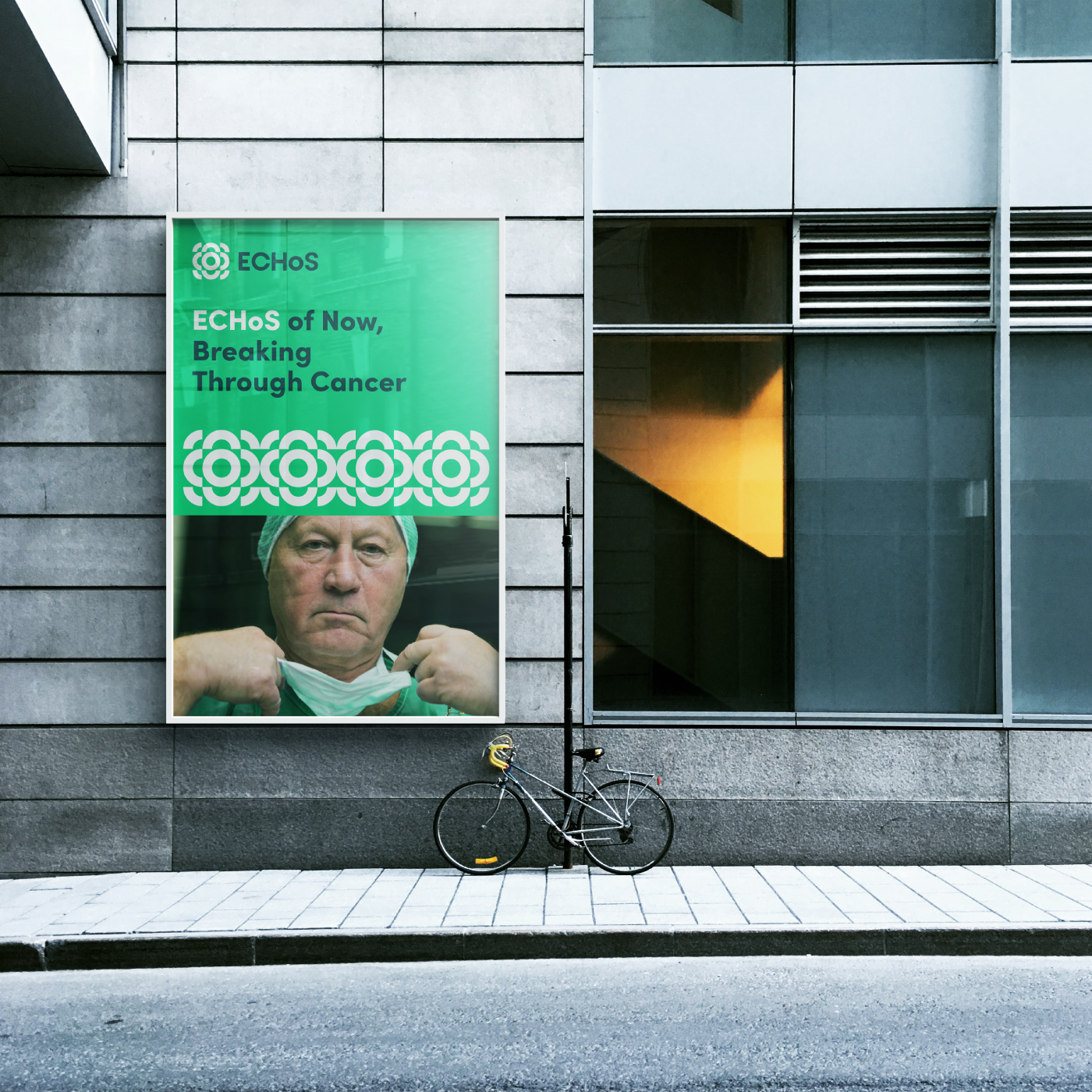
Our Approach: "Breaking Through Cancer"
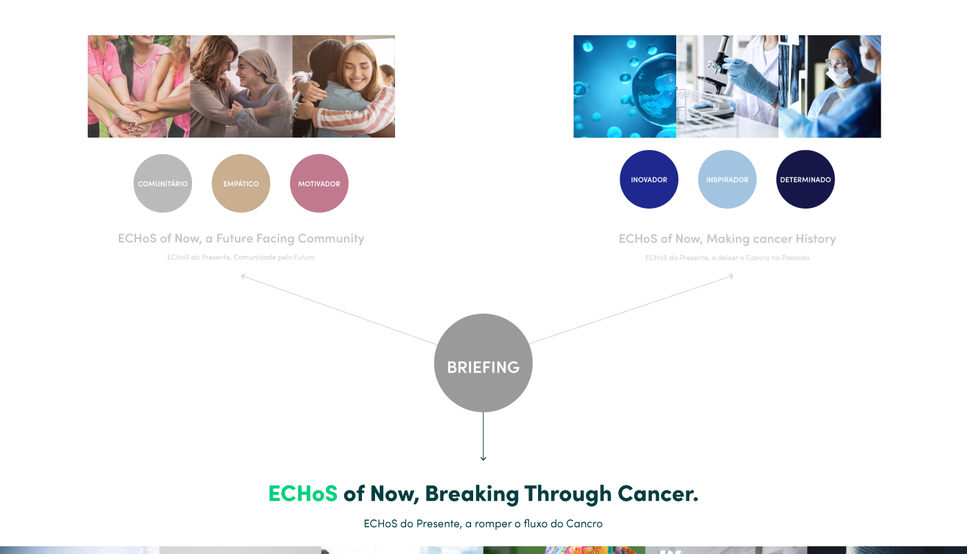
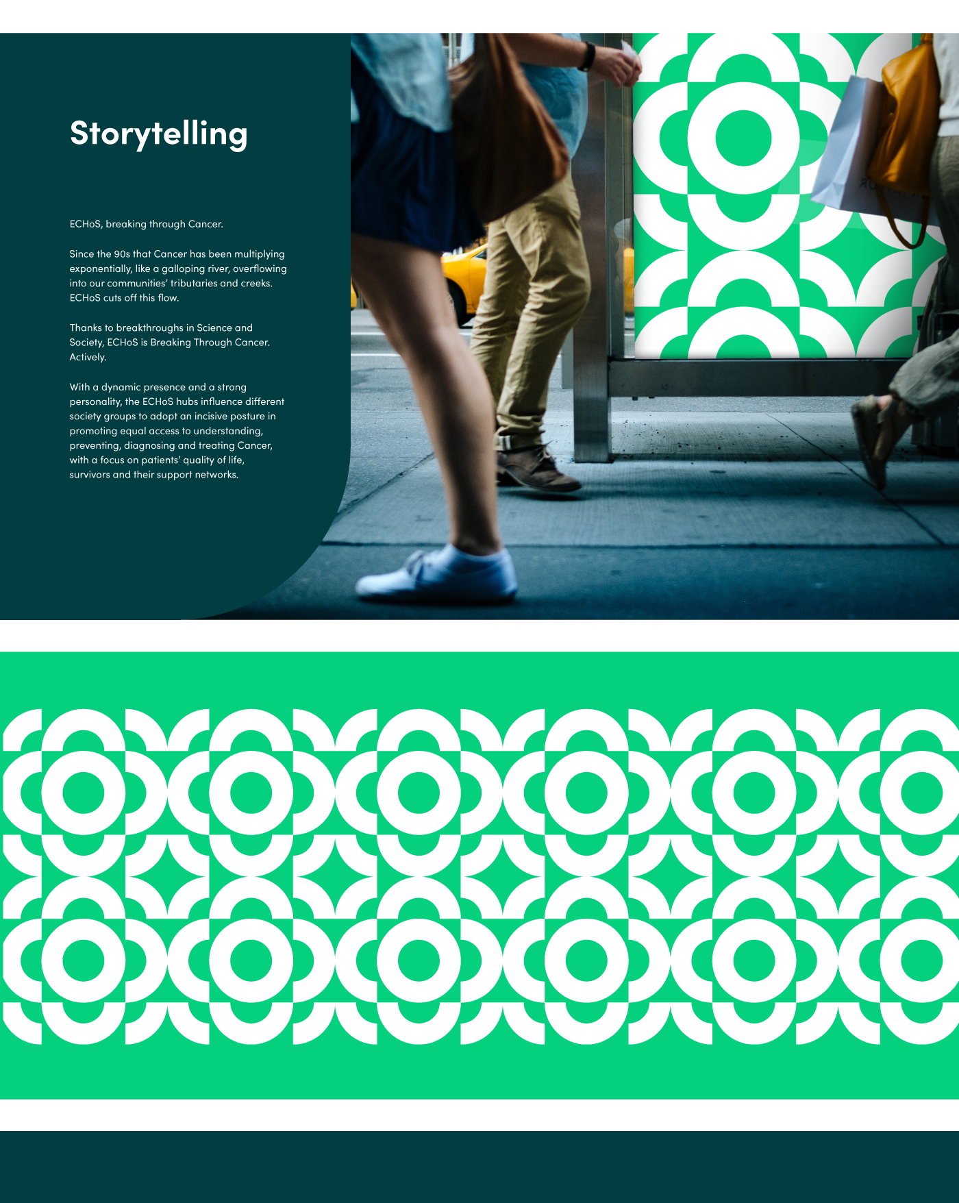
Most European consortiums settle for complex and generic logos. We chose the path of Discomfortology. We created a visual manifesto based on a harsh truth: since the 90s, cancer has been multiplying exponentially, advancing like a galloping river that floods our society.
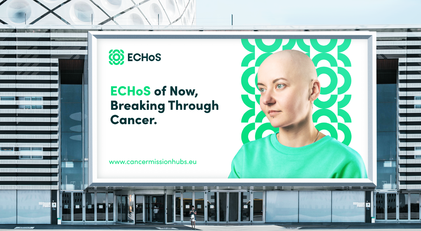
The role of the ECHoS project is to cut off this flow. That is how we designed the brand’s Storytelling and signature: “ECHoS: Breaking Through Cancer”. It is not just a promise; it is an active declaration of war against the disease, designed to influence public policies and civil society.
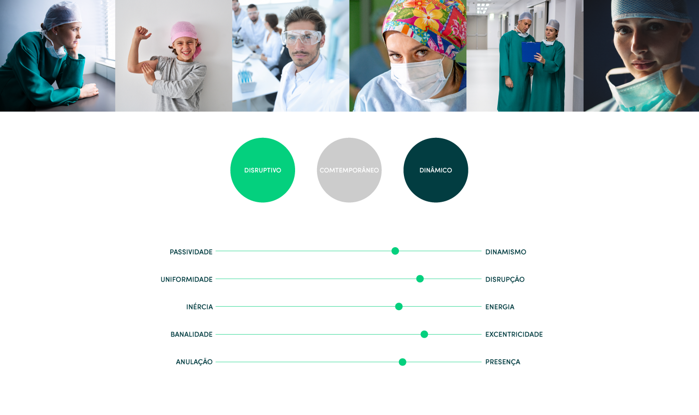
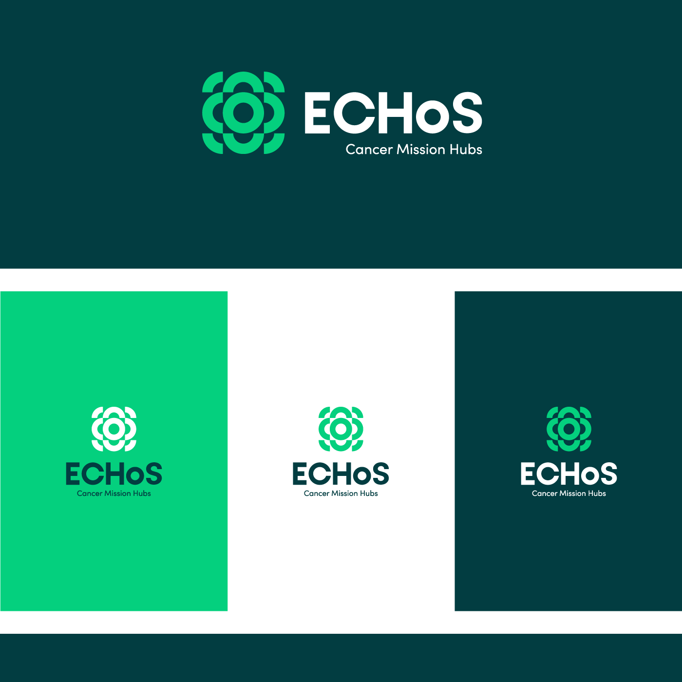
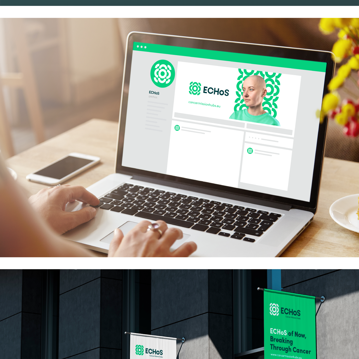
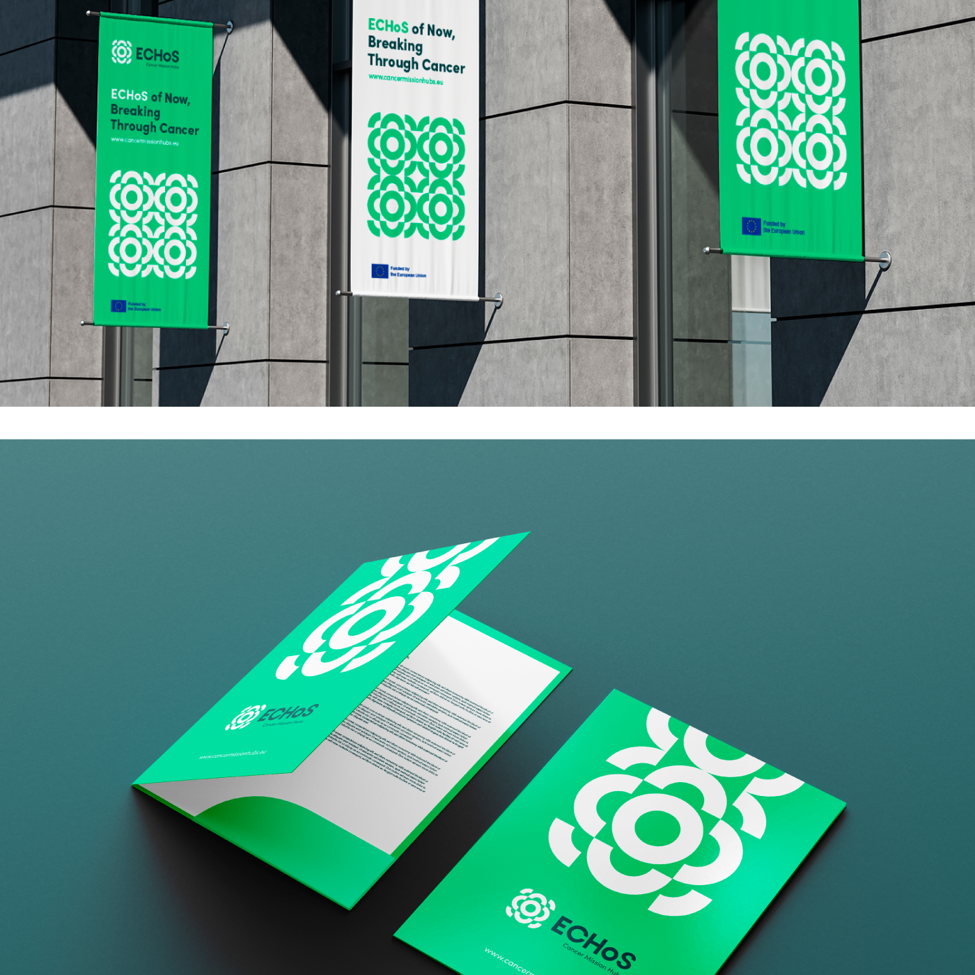
Visual Identity: Symmetry, Propagation, and Disruption
The identity developed by GRINGO lives at the strategic intersection of three concepts: propagation (the “echo” of joint actions), symmetry (a united European community), and disruption (cutting the flow).
In the created symbol, the propagation waves are visible but suffer a rupture—an incisive cut representing the blockade of the disease’s advance. To support this narrative on a European scale, we developed the brand’s entire universe:
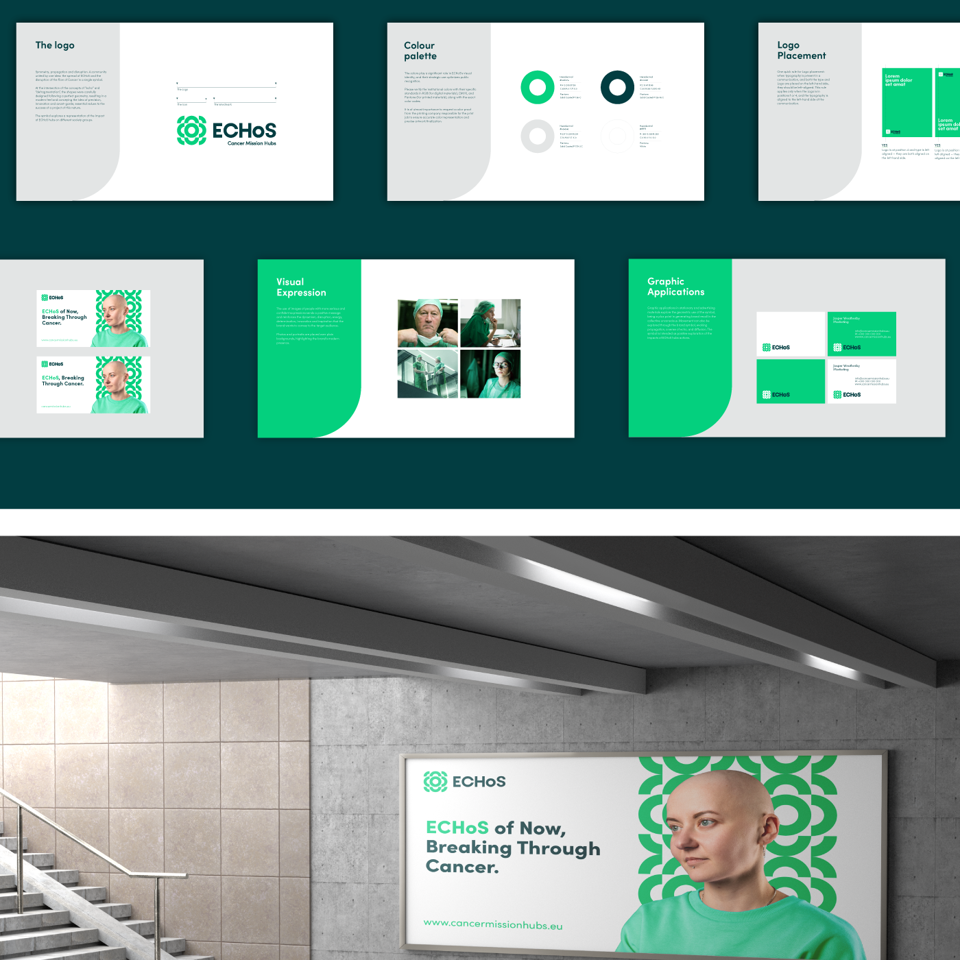
Global Brandbook and Guidelines for use by the 58 partner entities;
Verbal Identity and Tone of Voice to ensure a uniform discourse across dozens of languages;
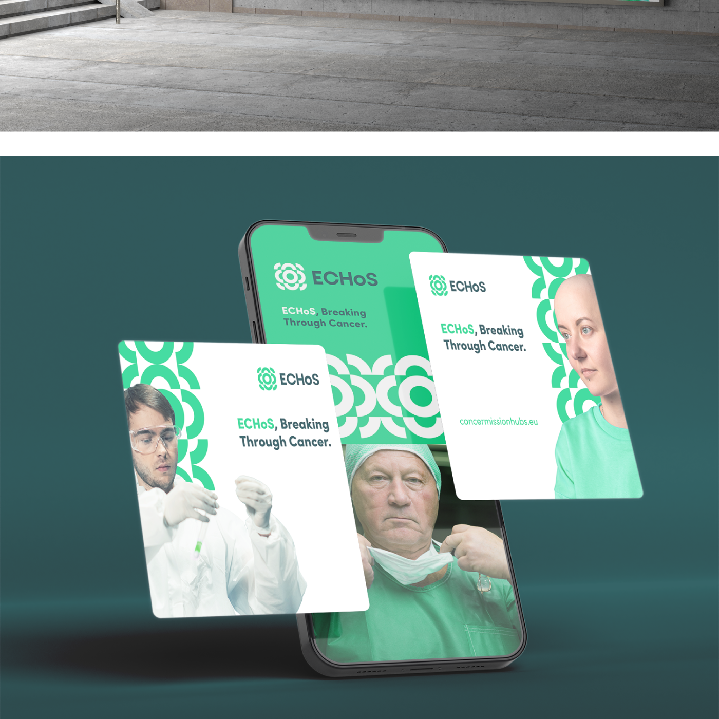
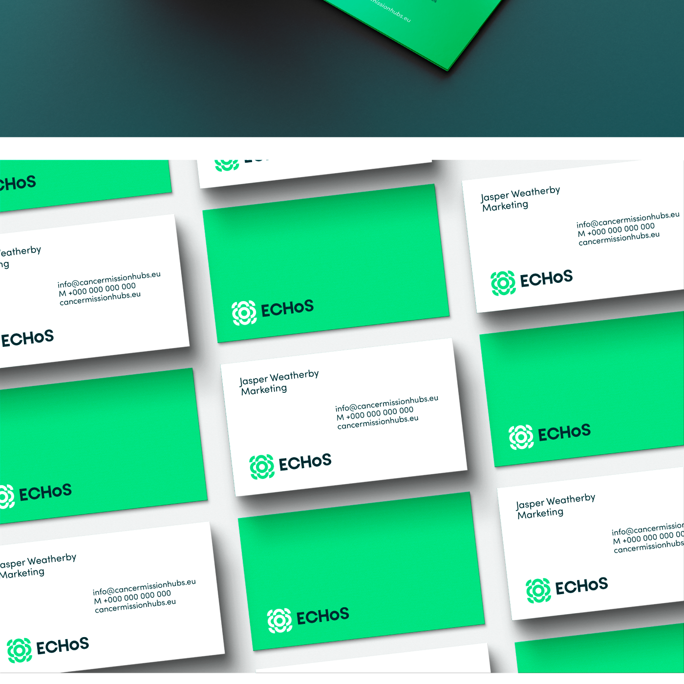
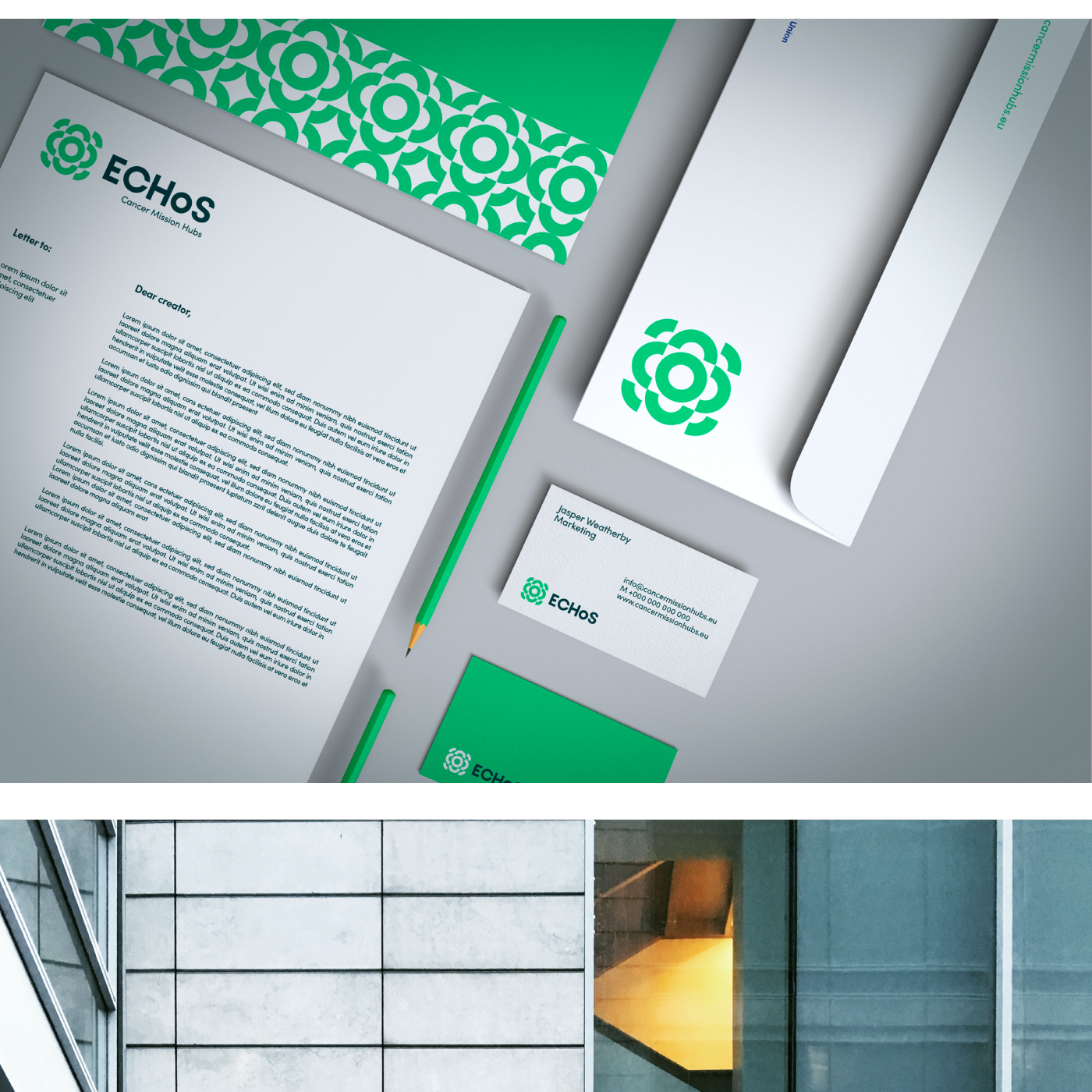
Tactical Communication Assets, from Roll-ups to corporate presentations and merchandising materials, ensuring that, from Portugal to Finland, the brand communicates with the exact same weight and urgency.
The Impact: Bronze in Creativity, Gold in Strategy
The ultimate proof that institutional healthcare design doesn’t have to be static and predictable? This international branding project was awarded Bronze at the Lusophone Creativity Awards, proving that GRINGO’s “uncomfortable creativity” works even on the most complex European stages.
Did you like this brand?
Challenge GRINGO to question your brand and embrace the discomfort.