Anúncios de Contratação Pública
Branding
Instituto dos Mercados Públicos, do Imobiliário e da Construção, I.P. (IMPIC, I.P.) is a public institute whose mission is to regulate and oversee the construction and real estate sector, as well as the regulation of public contracts. Within this scope, IMPIC partnered with GRINGO to give a face to the new generation of electronic forms — Anúncios de Contratação Pública (“Public Procurement Notices”) — a new reality in public procurement and a national instrument.

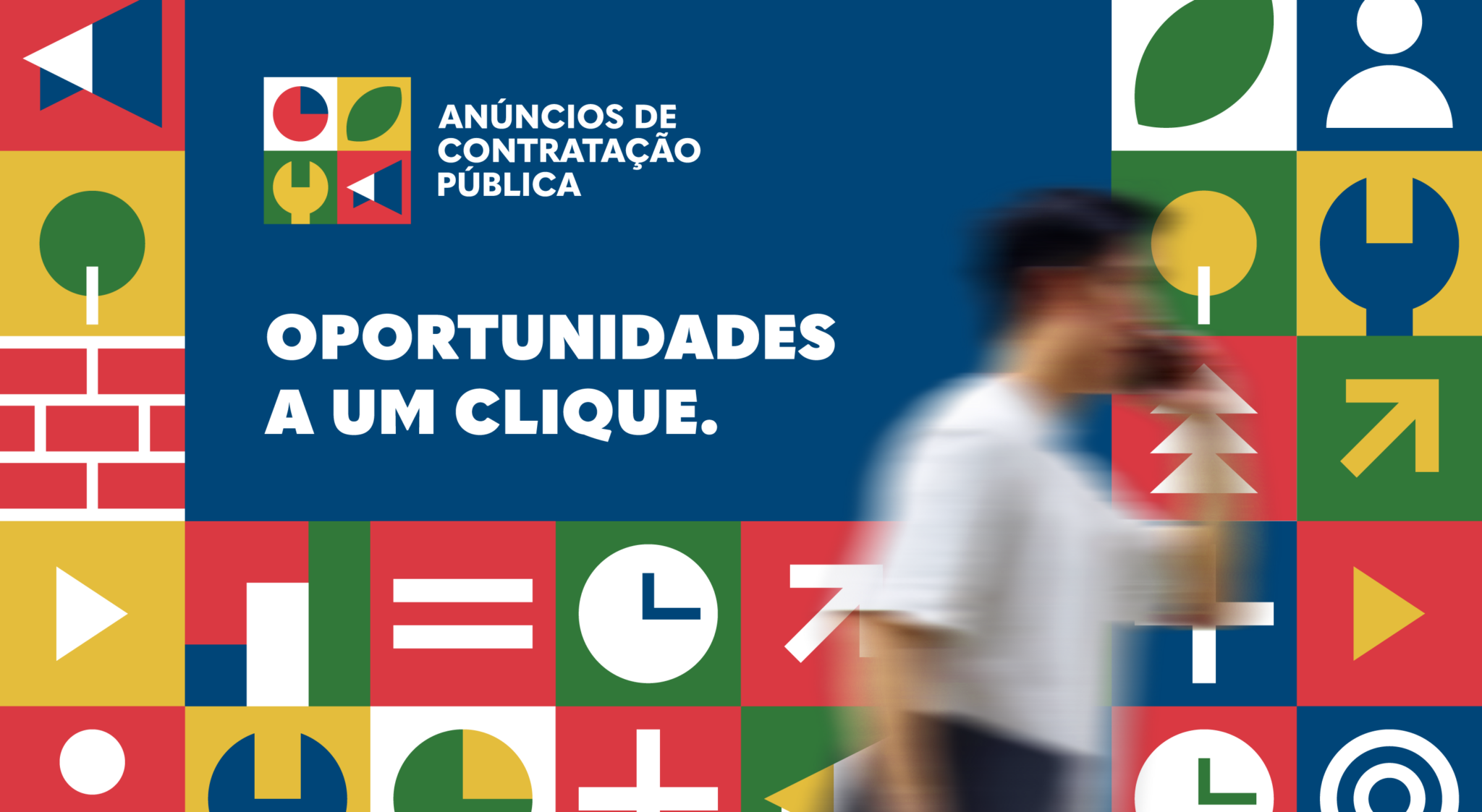
Anúncios de Contratação Pública is a national instrument and a crucial initiative to promote and attract companies, drive the digital transformation of procurement procedures, and improve the functioning of public contract award systems.
This project focused on giving a Portuguese identity to the eForms, the European term for the new generation of electronic forms. This initiative primarily targets public entities (contracting authorities), as they are responsible for initiating procurement procedures. This evolution benefits all stakeholders:
- Economic operators
- Contracting authorities
- Government and civil society
Our Approach
Our goal was to communicate the major advances brought by the eForms to public procurement — a measure of simplification, consolidation, and transparency.
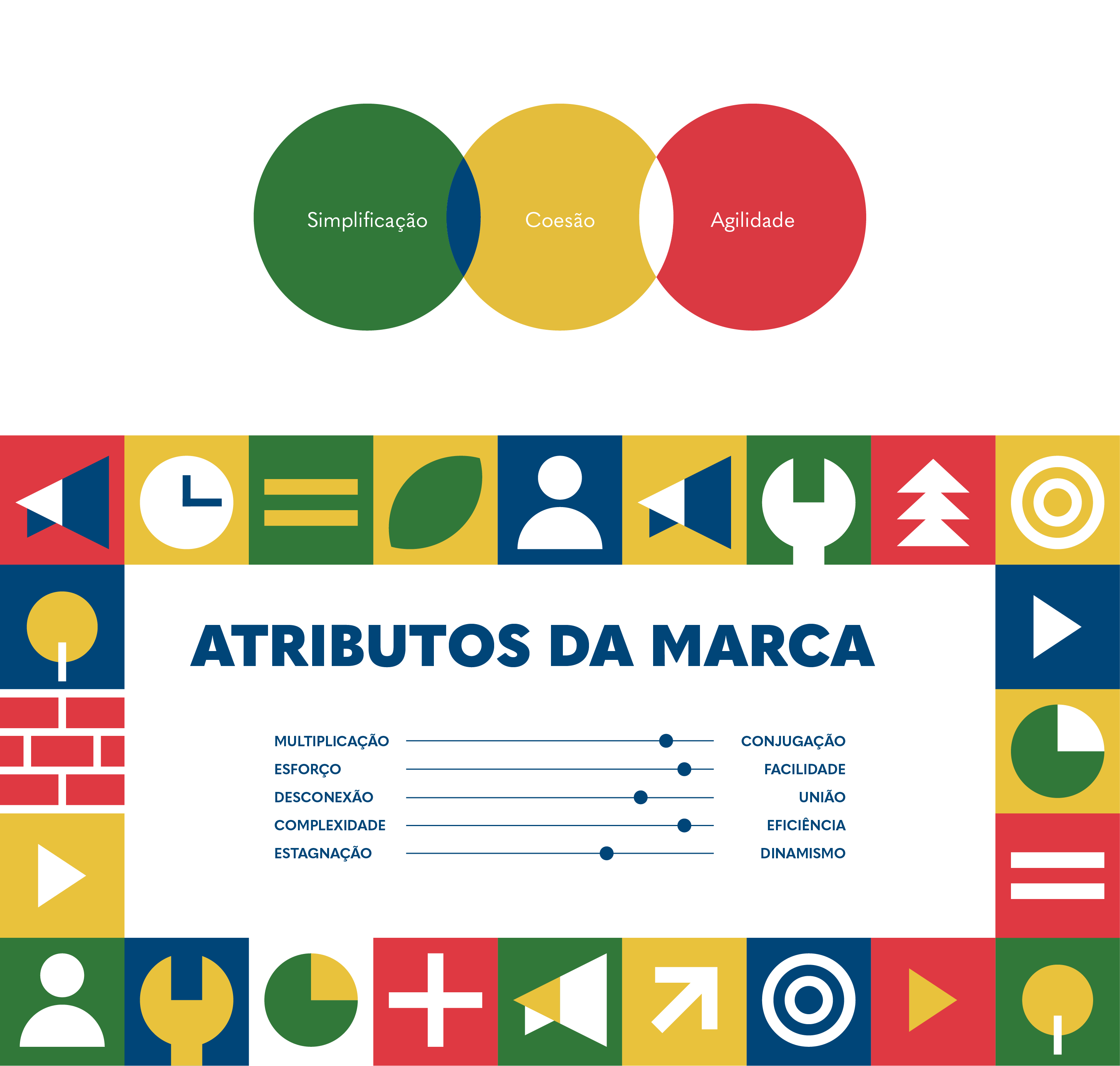
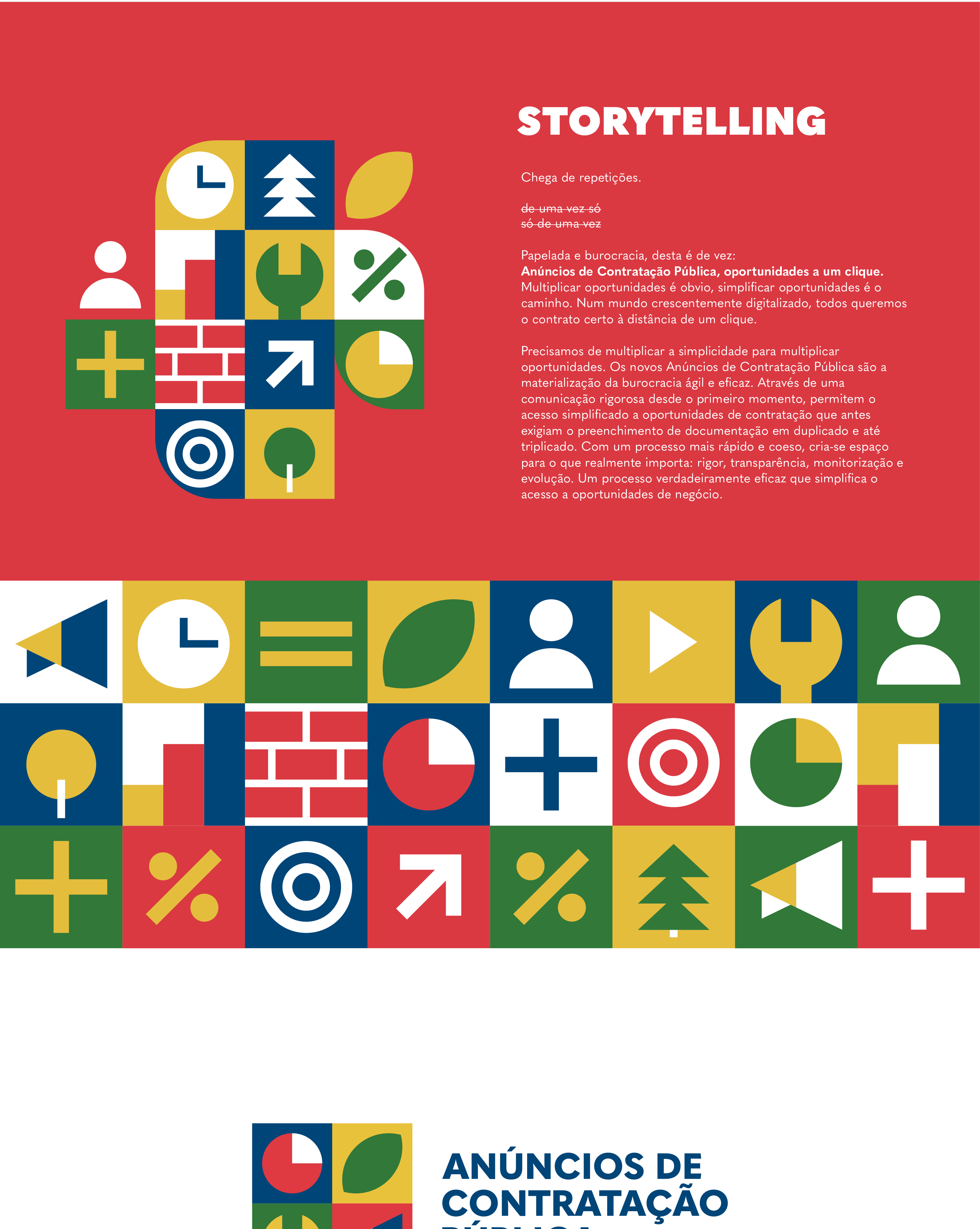
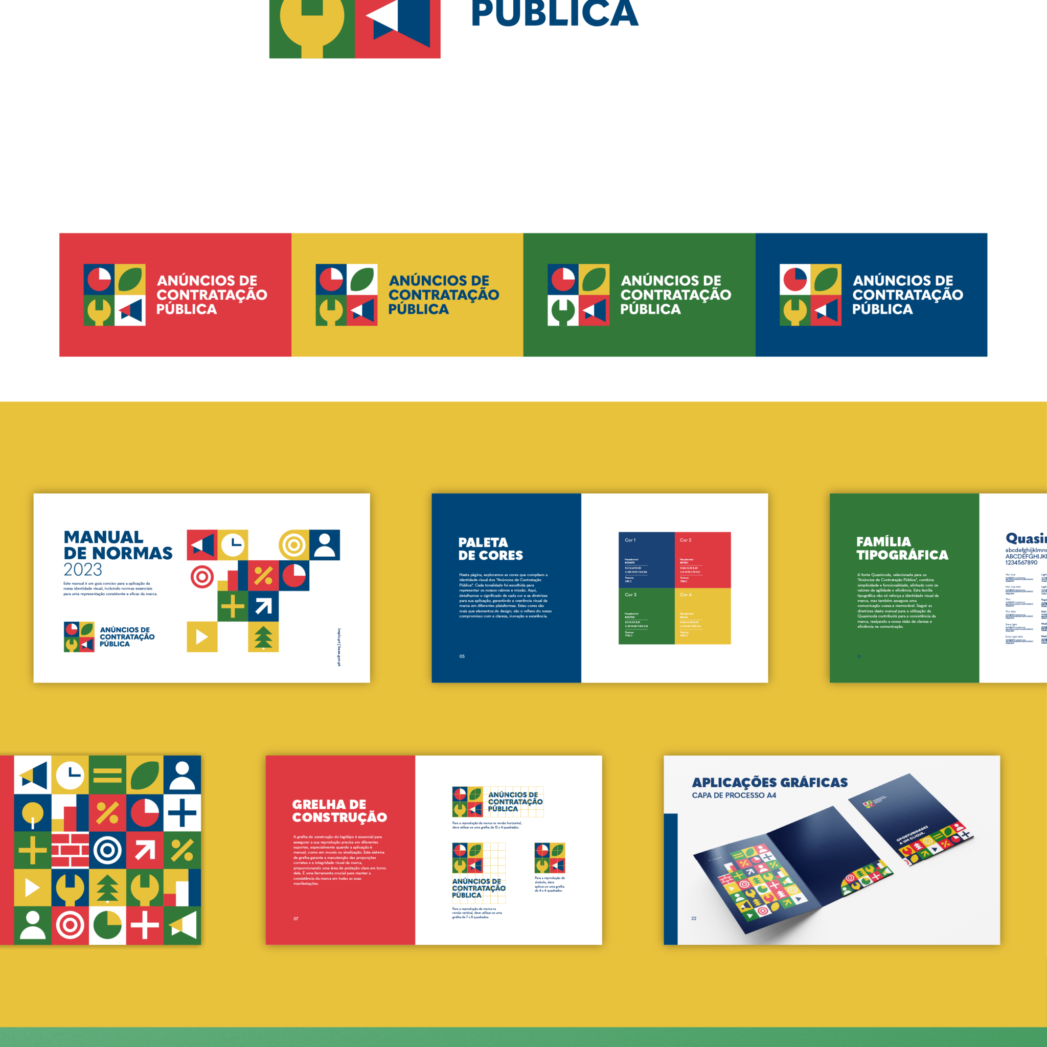
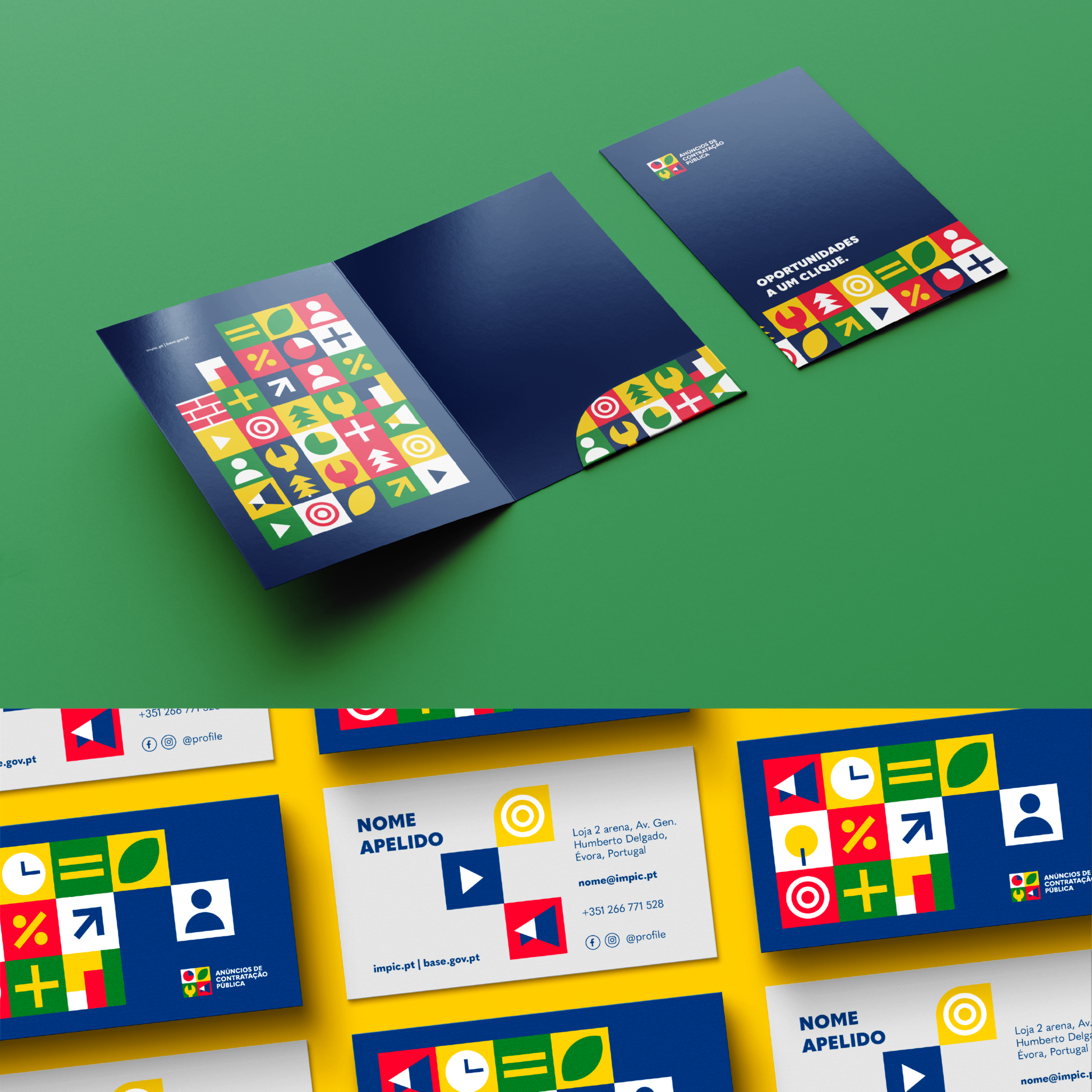
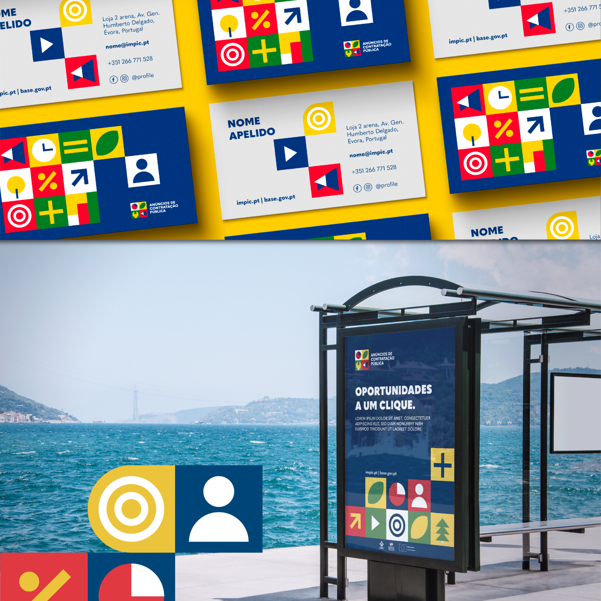
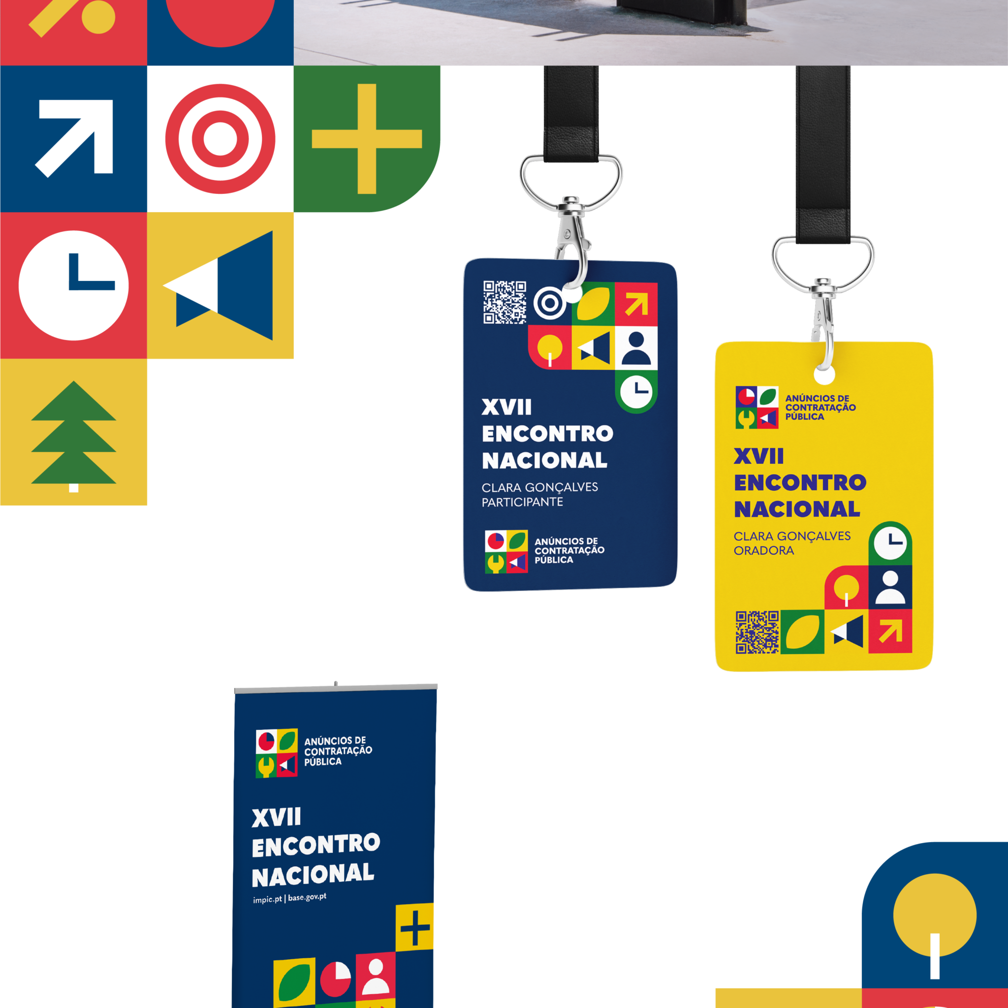
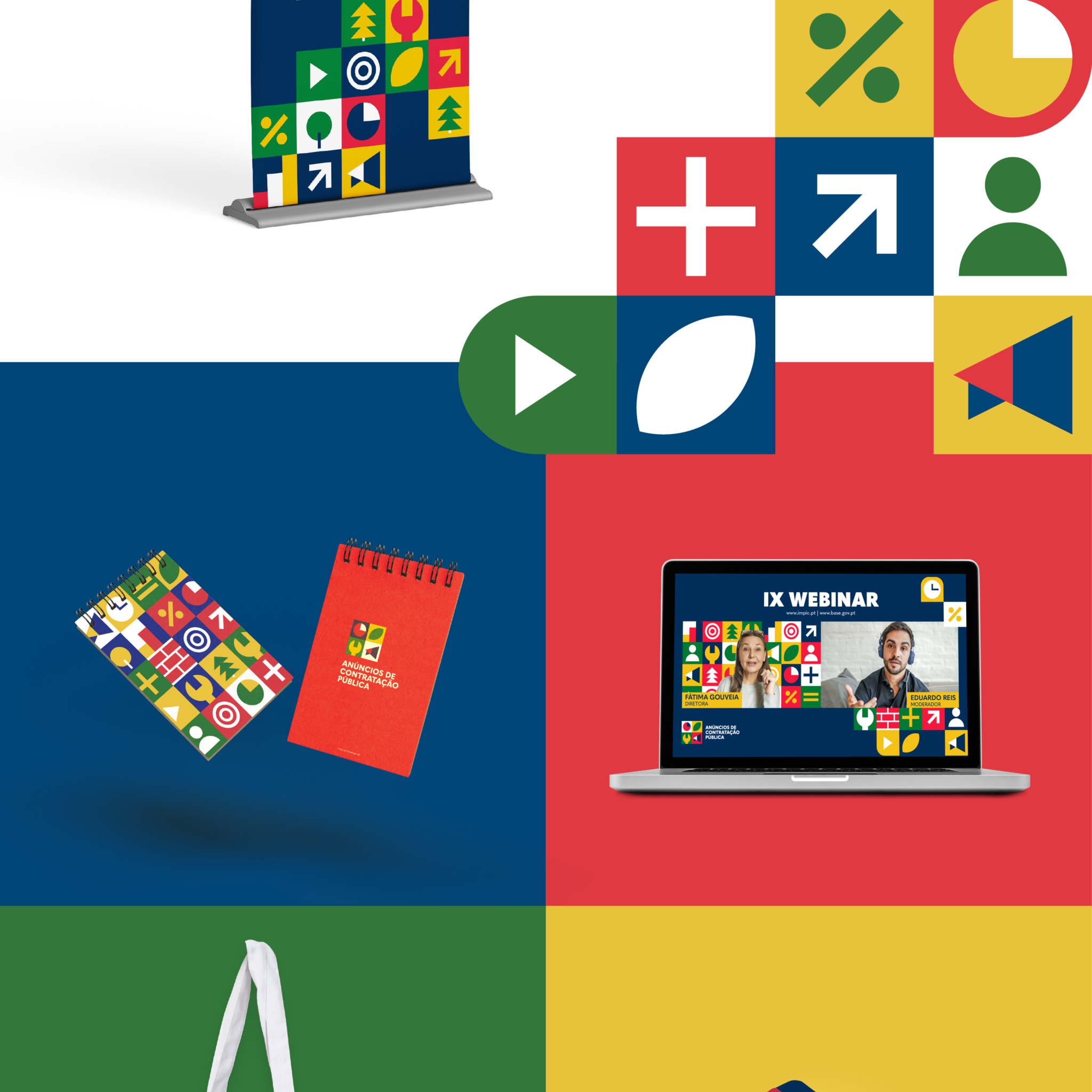
Once the creative guidelines were defined together with the client — Lightness, Less Bureaucracy and Dematerialization, Flexibility, Simplification and Harmonization, Transparency — this logo and visual identity were created to embody the concept of “Bureaucratic Simplification.” This is highlighted by the creative use of geometric shapes, symbolizing combination, simplicity, and cohesion.
The vibrant colors — green, yellow, red, blue, and white — establish a sensory connection to Portugal’s colors, conveying diversity and energy. The Quasimoda font complements the design with a touch of modernity. The pattern, composed of various geometric symbols, represents the diversity of businesses and companies, while the overlaid paper texture bridges the digital with the physical, symbolizing the union of tradition and innovation. This logo is a visual representation of the simplification and modernization of processes, reflecting a fresh and dynamic approach to bureaucracy.

Did you like this brand?
Challenge GRINGO to question your brand and embrace the discomfort.
