Qloop Architects
Visual Identity
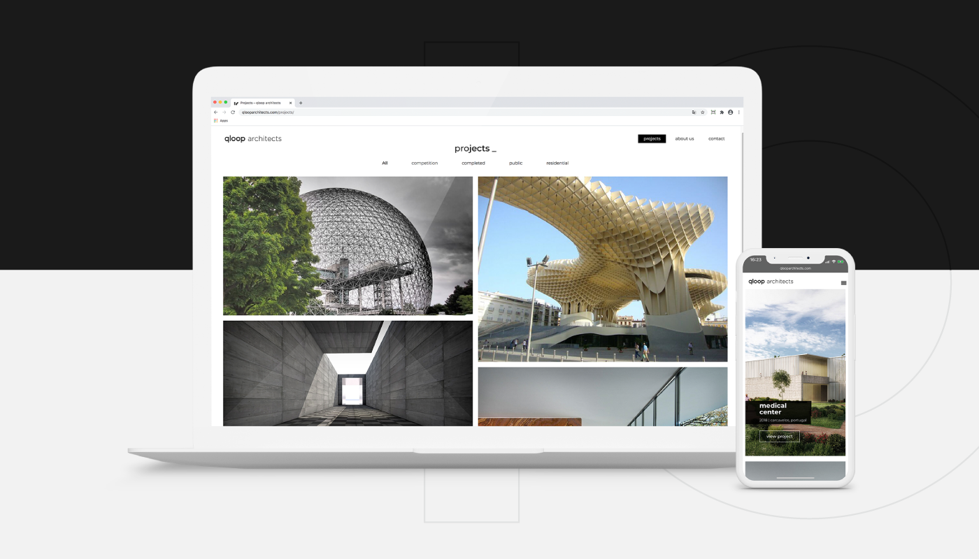
The visual identity of Qloop Architects was entrusted to GRINGO – Uncomfortable Creativity, in a smart minimalism exercise that the architecture studio values deeply.

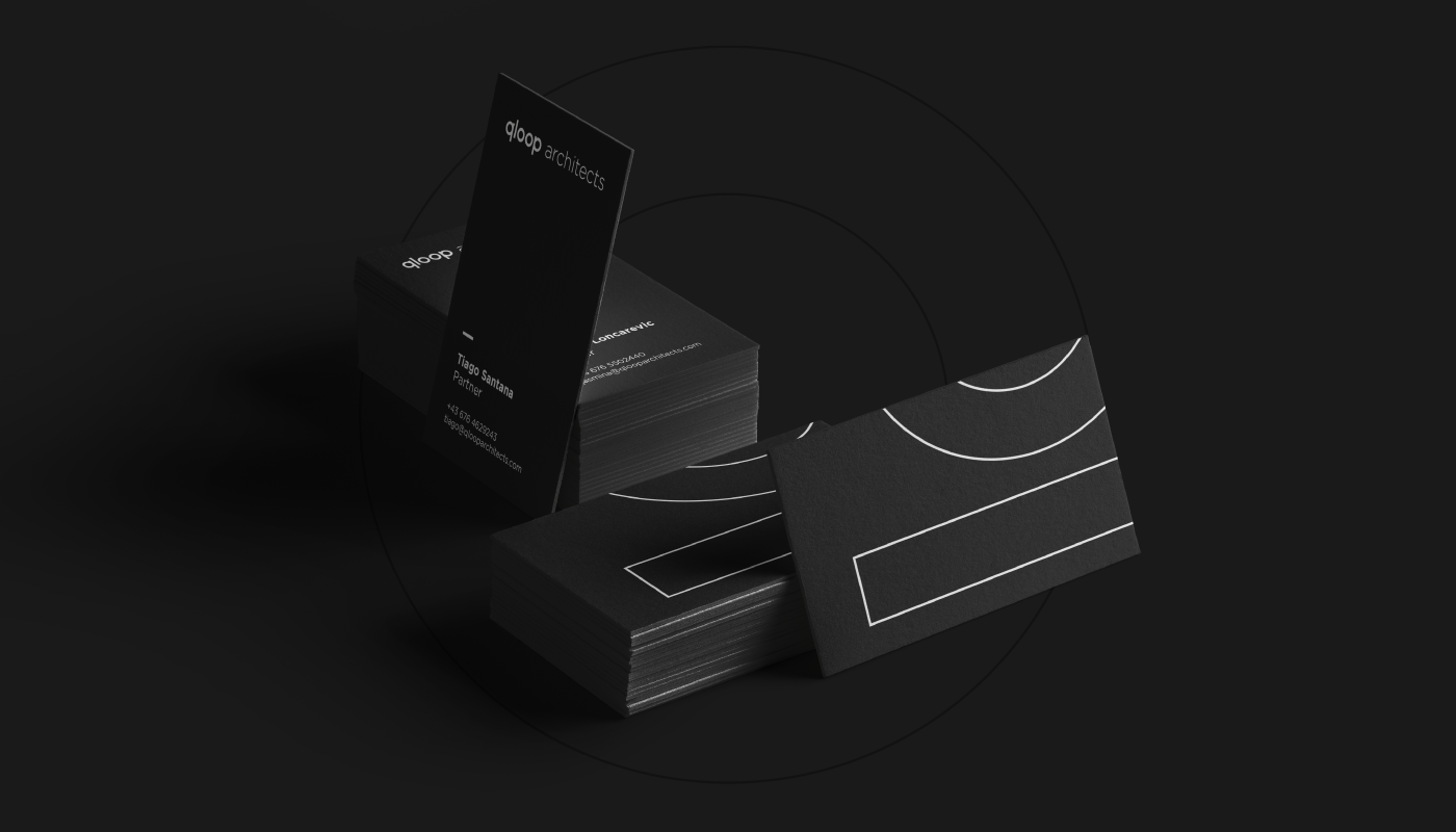
“Smart minimalism” is the philosophy coined by Qloop Architects to describe how they design and develop their projects. This concept became the guiding principle for the visual identity we created for the brand. The studio applies a minimalist approach — both visually and in complexity — ensuring that every element in a building or home flows seamlessly as “one” (corridors, spaces, doors, and more). The phrase “less is more” perfectly encapsulates this recurring concept in Qloop’s work.
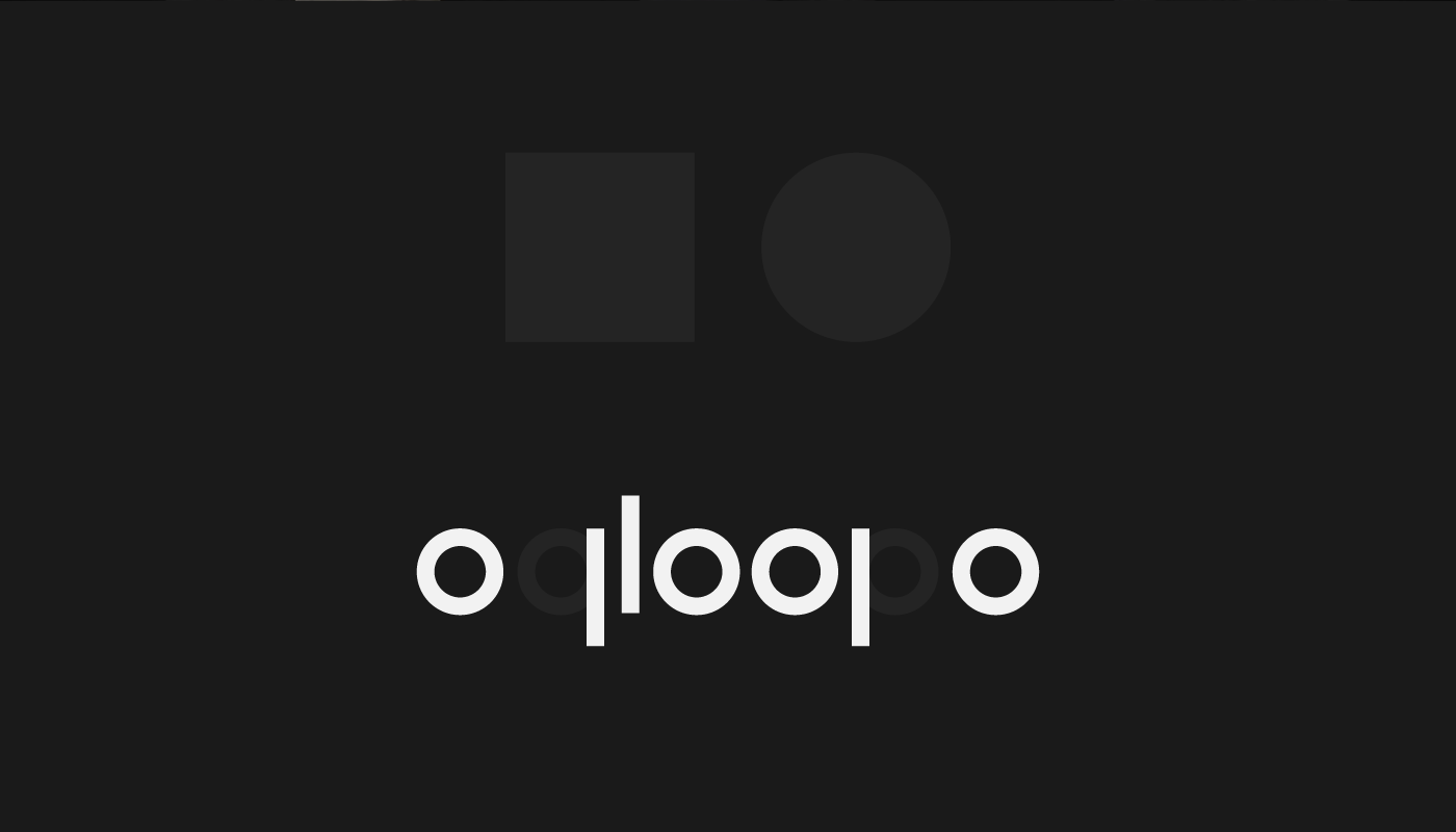
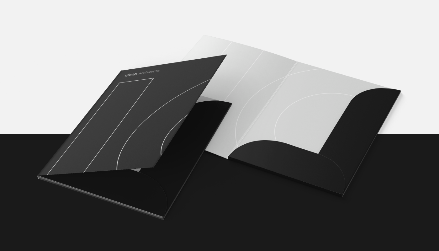
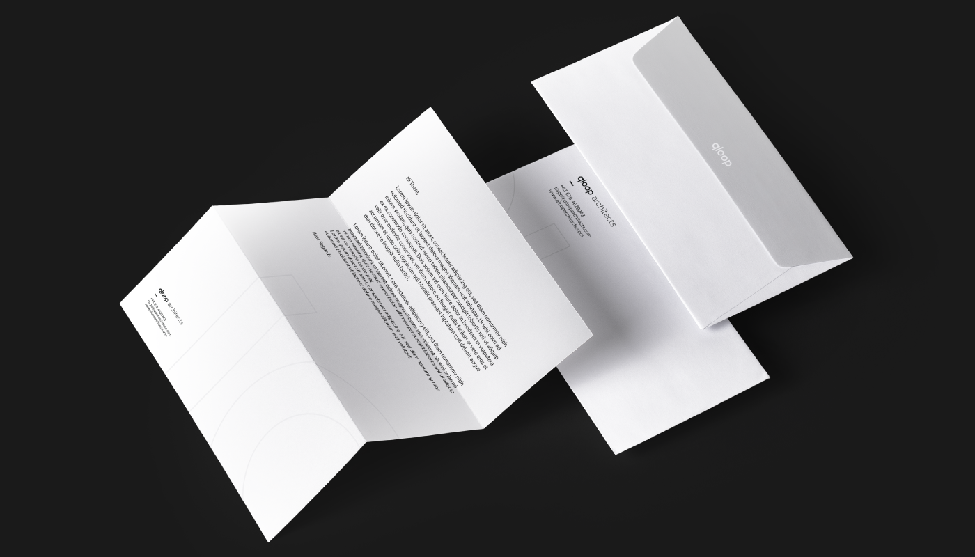
The brand’s visual concept is based on perfect circles and straight lines intersecting at 90°, reflecting the minimalist architectural aesthetic. The result is a sober, contemporary, and functional logo and visual identity.

Did you like this visual identity?
Challenge GRINGO to question your brand and embrace the discomfort.
